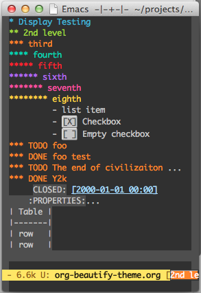
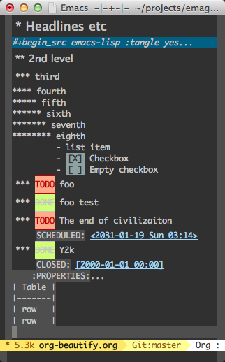
So I have built a sub-theme that should ease some of that eye strain, and calm down your fruit salads.
Before
After
Enter org-beautify-theme.el (MELPA package is available)
This is not the last word in making org-mode look nice, but just the first word. It will get better!
Org-Beautify is an emacs sub-theme. You load it over-top of your main theme, and it adds an extra chunk of functionality to it. It is fully compatible with the moe-theme, but should be compatible with most themes.
I am not sure why more sub-themes like this are not developed, but they should be. Rather than theme authors having to define colors for every single package, they could define base colors. Package authors that choose to define faces, could then just extend upon that.
For example: The movement (hehe, I just said movement) in the CSS/Webdev world is to define a set of colors then define how those colors are used. (Generally you need a css preprocessor to do this properly)
For example:
@red-1: hsl(0, 39%, 54%);
@green-1: hsl(120, 39%, 54%);

/* .. more colors defined ..*/

@danger-button-background: @red-1;
@success-button-background: @green-1;
If theme could agree on a standard set of color names, then agree on a set of standard color descriptions, then all a user would need to do is choose a color palette (solarzied, moe-yellow, etc.) then choose a scheme (angry-fruit-salad, floofy-designer-wonk, etc) and their off to the races.
Check the Literate Source for more information.
Anyhoo, enjoy org-beautify!